 Red wine, Goodwill jackets and the WAGs: Meet Australia’s friendliest golf club
So, you want to design a golf hole? A beginner’s guide to the do’s and don’ts
So, you want to be a golf-course architect. Or, at least, you plan to enter the GOLF Magazine + Nicklaus Design Challenge.
Allow us to offer some advice from an expert in the field.
As a senior designer at Nicklaus Design, Chad Goetz will tell you that everything he and his colleagues do is dictated by the site they’re given.
“It all begins and ends with the piece of land,” Goetz says. “That, along with what the client wants to accomplish.”
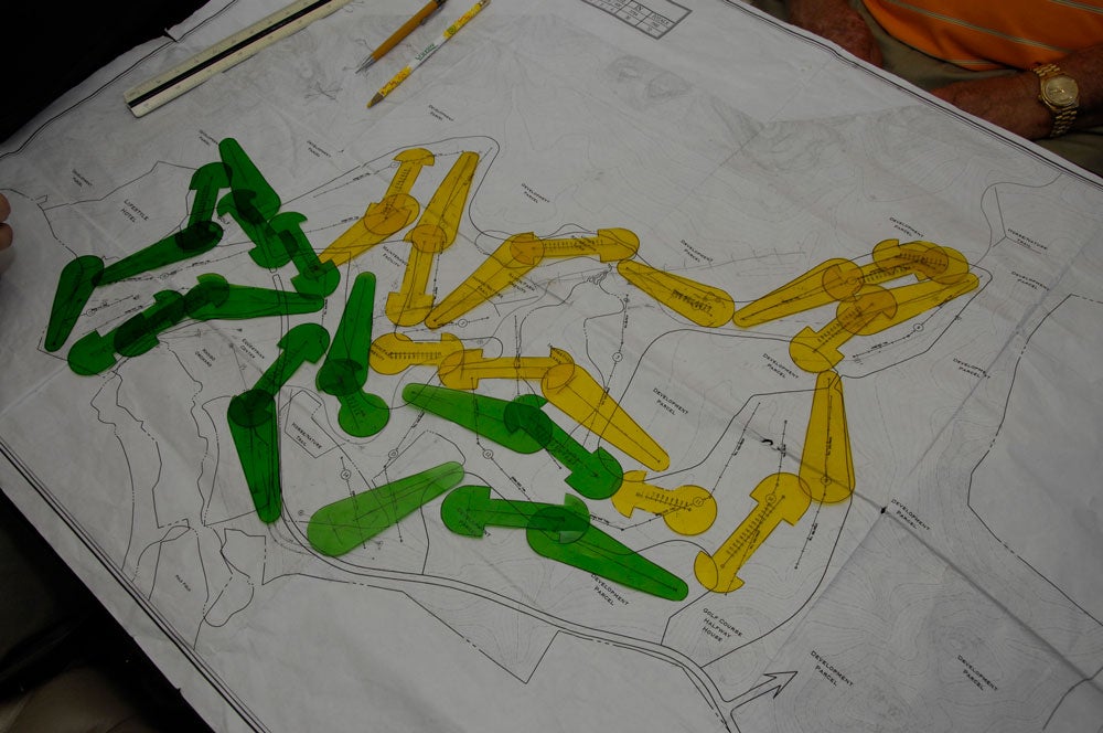
Once that’s been determined, it’s on to developing the course routing and rhythm, crafting holes that make the most of the terrain while providing varied looks and shot-making demands.

“You’ve got to go with what the land gives you but you’re also trying not to have six long par-4s in a row,” Goetz says. “You want to mix it up with various angles and lengths and wind directions to create a compelling challenge.”
In short, designing an entire course is a very different job than dreaming up a single hole from scratch. Yet many of the same principles apply.
With the GOLF Magazine + Nicklaus Design Challenge underway, GOLF.com asked Goetz to flesh out the fundamentals those in his business lean on when creating a hole.
Think of them as your architecture guidelines: 8 do’s and don’ts of golf design.
1. Start with the green
The Golden Age architect A.W. Tillinghast likened greens to human faces, the defining feature on the body of a hole. What does that suggest? When you’re sketching your design, the putting surface is a good place to start. Envision the shots you want players to confront on their approaches — long, low runners? high-lofted irons? — and design the green accordingly, its shape, size and contouring suited to the shots you expect it to see. “It’s tempting to have fun by throwing in a lot of wild contours or severe bunkering,” Goetz says. “But remember that what you’re doing needs to make sense in the larger context. It’s going to dictate what you do with the rest of the hole.”
2. Keep it entertaining
“Golf is a game,” Goetz says. “It should be fun.” Of course, like many elements of golf design, what qualifies as “fun” is subjective. But as a general rule, punishment does not equal pleasure. “Every course has to have a hardest hole,” Goetz says. “They have their place, but I don’t necessarily think of them as being fun to play. So, if I’m designing a single hole, over-the-top difficult is probably not the way I’d go.”
More alluring than a long, bunker-laden brute is, Goetz believes, a beguiling hole that presents a golfer with strategic choices. Do you play safe off the tee, knowing that you’ll face a testier approach shot? Or rear back with your driver in hopes of setting up a simple pitch? That’s the basic thinking, though the potential variations on the theme are boundless. “Risk and reward is a phrase you hear a lot because it’s at the heart of a lot of what we do,” Goetz says. “We’re trying to create a puzzle for the golfer to solve that fits into the larger puzzle of the course.” Now, that’s fun.
ADVERTISEMENT

3. Don’t go full Golden Tee
A minefield of bunkers might look cool when you’re doodling on a cocktail napkin. Ditto an island tee playing to an island fairway and an island green. Just remember: You want your doodle to play cool, too. “I’ve played a few holes and thought, ‘Wow, that must have looked really great on paper,’” Goetz says. Bottom line: If what you’ve sketched bears closer resemblance to a video game than a golf hole, you’d be wise to scratch it and start again.
4. Consider contours
Sand and water are all well and good. But there are other ways to defend a golf hole. “It’s easy to throw 15 or 20 bunkers or a lake out there,” Goetz says. “But some of the more interesting strategic concepts are created with topography.” Think, for instance, of the greens at Augusta, which are built to defy certain angles from the fairway and leave you all but dead if you’re above the hole. Or some fairways at the Olympic Club, which dogleg one way and tilt the other, asking you to hit a draw or fade with the ball above or below your feet. “It’s remarkable how even a subtle slope or contour can affect a shot,” Goetz says. “A lot of golfers might not think of them, but those factors have a huge influence on how a hole plays.”
5. Allow for recoveries
Phil Mickelson smoking a 6-iron from the pine straw at Augusta. Tom Watson chipping in from the rough at Pebble Beach. Think of some of golf’s most memorable moments; many have been recovery shots. A well-designed hole should allow for them. “With every hole, we’re trying to define how it should be played, but we’re also trying to determine what the penalty is if you don’t play the correct shot. How is that going to set up?” Recovery shots call for skill and imagination, which translate into excitement. As satisfying as it is to bomb one down the middle, “a hole where that’s the only option is pretty dull,” Goetz says.

6. Place trouble in plain view
Blind shots can be compelling. But a guiding philosophy at Nicklaus Design is to keep most targets and trouble in plain view. “We might blind you on, say, a par-4, but that will be part of the strategy,” Goetz says. “For example, if you play conservatively or hit a poor shot, now you can’t see everything in front of you. But typically, Jack works very hard to make everything visible.” If water awaits, he doesn’t simply want you to know it’s there. He wants you to be able to see its edges. Same with greens. “We may not show you the entire putting surface,” Goetz says. “But we’re trying to show you the corners of it at least, so you have an idea of your limits.”
7. Accommodate all abilities
One of the toughest aspects of golf design is walking the fine line of forgiveness, the better to appeal to a range of skills. “The question always is, ‘How do you make it challenging for the good player but enjoyable for a higher handicap?” Goetz says. One way to do that is with offset tees, which create varied angles and differing demands. “If you have a dogleg, not only does the hole get shorter from the forward tees, but it’s also straighter,” Goetz says. “So that someone playing up can hit a straight shot, whereas as someone from the back has to take on angles.” Given how far elite players hit it, forced carries aren’t an issue for them. But what about the rest of us? There are no hard-set rules, but Goetz says that average weekend golfers on a 6,300-yard course shouldn’t be asked to fly their balls much more than 130 yards.
8. Draw to scale
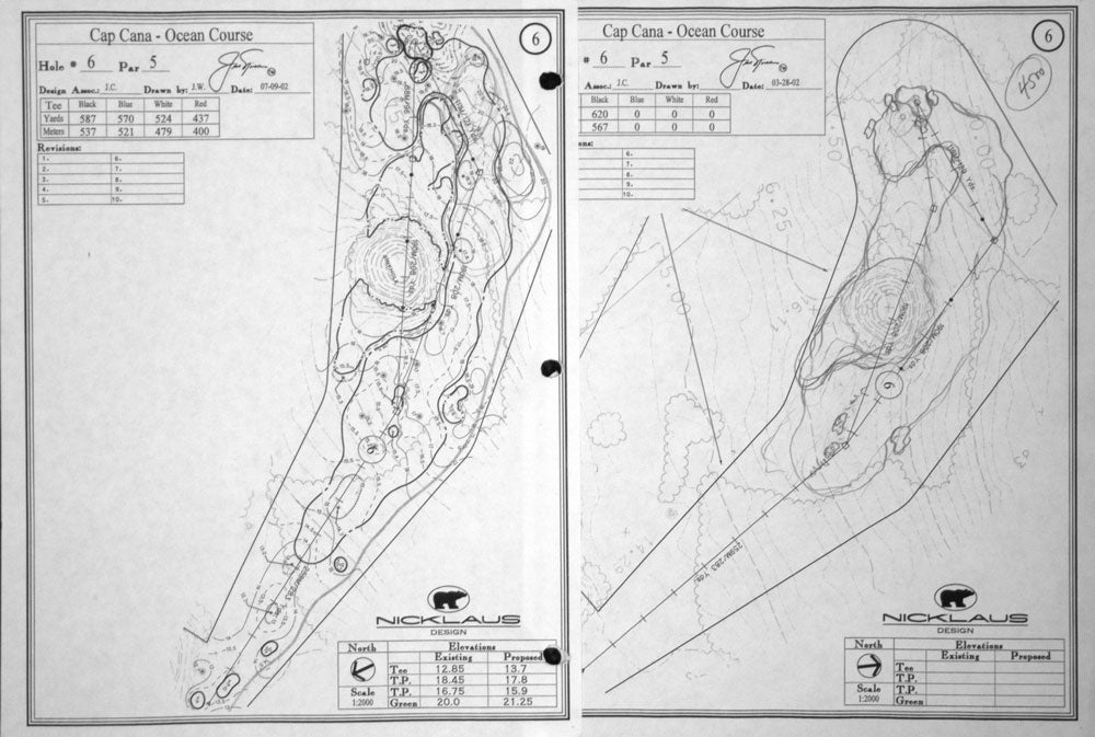
For the purposes of the GOLF Magazine + Nicklaus Design Challenge, contestants have been asked to submit their designs on 8.5” x 11” paper. That’s not a lot of space. But it’s still important to try to draw to scale. What is that scale? Goetz says to think of it this way: one inch equals 200 feet.
ADVERTISEMENT


