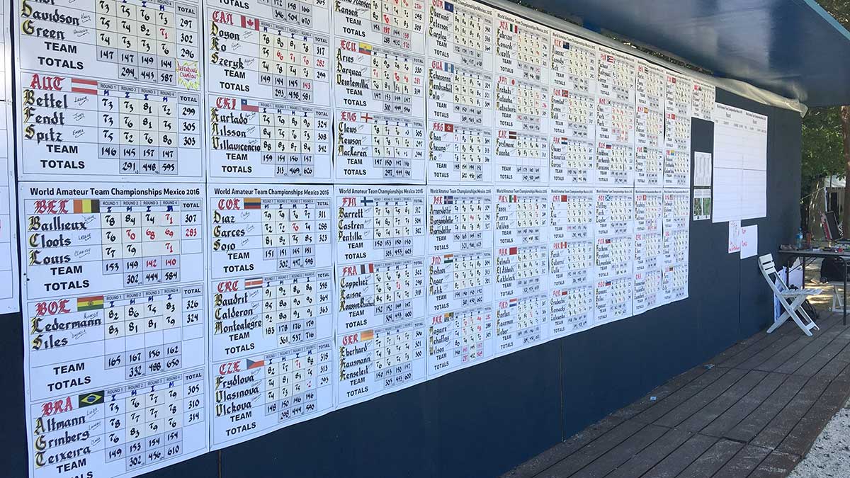
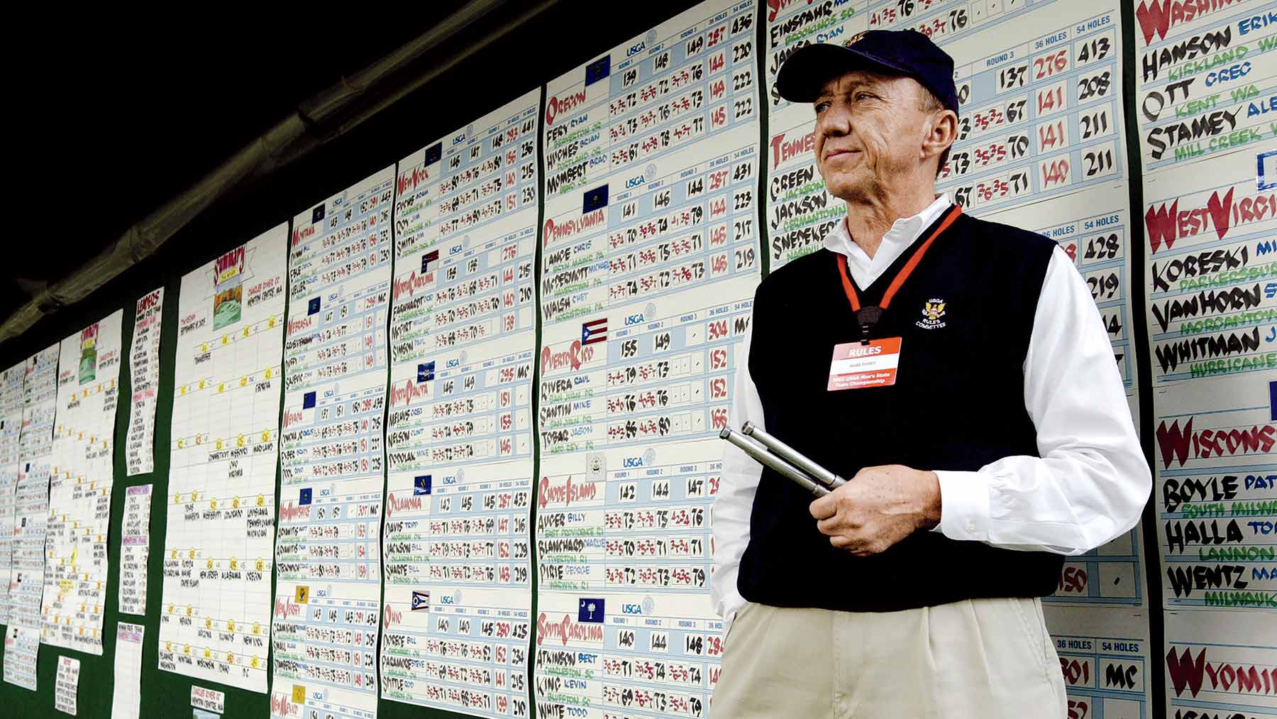
The art of scoreboard calligraphy evokes golf’s centuries-old roots. While it’s not as commonly seen in the pro ranks these days, it is still out there, a staple at some events and many club championships and tournaments.
We recently profiled some of the most experienced and best golf scoreboard calligraphers in the game, but we’d be doing you, dear reader, a disservice if we didn’t hand off a few of their tips.
When it comes to golf scoreboard calligraphy, all of our pros are on the same page about the ABCs of the work — or, as one expert sums it up, if you’re thinking about fancying up your next corporate outing, the A.R.T. of it all.
Paging Mr. Write: An appreciation of scoreboard calligraphy, which brought flair and old-school class to tournament golfBy: Josh Berhow
1. Accuracy. Hometowns, names and scores must be correct at all times. Numbers and letters should be rendered in a consistent style too.
2. Readability. Sure, as fonts go, Old English is classy, but what good will that do if even Shakespeare can’t read it? Same goes for elaborate color schemes. In other words, no fruit salad.
3. Timeliness. It’s a golf tournament or a money game. Players and your pals want scores ASAP. Don’t make them wait.
4. Finally: Find your style! Slant your letters, add a shadow, mix in a logo. Without making it too busy, make it… memorable.


