Bethpage Black, last week’s PGA host, needs little introduction. Its difficulty and iconic warning sign are two of Bethpage’s most well-known features. But another iconic aspect to the course is its “Caddy Boy” logo, which is found on tons of golf apparel, accessories and equipment. But what’s the story behind the logo?
If you haven’t seen it before, Bethpage’s logo features a looper holding a bag of golf clubs. Two clubs are sticking out of the bag, and the caddie is wearing black shoes, yellow socks, blue pants, a red shirt, and a green hat. Check out the logo below.
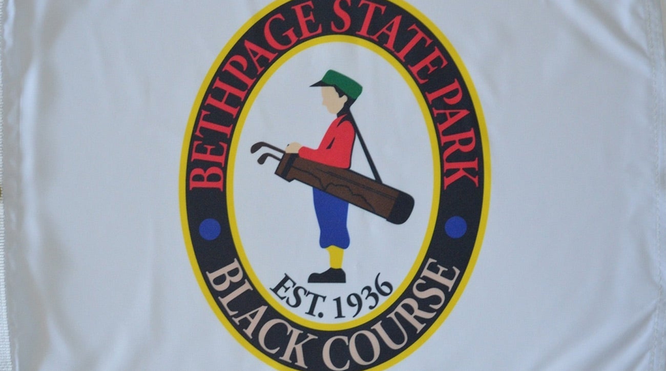
The color of each piece of clothing that the Caddy Boy is wearing represents each of the five courses at Bethpage State Park, which are Black, Blue, Green, Red, and Yellow. The colors are also supposed to symbolize both the spirit of golf and the course’s connection to the past when it was built during the Great Depression.
Urban planner Robert Moses, who helped open Bethpage to the public as head of the Park Commission, was the first to suggest that the Caddy Boy be cut in every shutter on Bethpage’s new clubhouse in the 1930s. The cutouts of the Caddy Boy in the shutters served as the inspiration for the course logo. Wooden cutouts of the Caddy Boy were also used to put on every tee sign across the courses, according to Golf Digest.
Along with Moses’ work to make Bethpage accessible to all, course architect A.W. Tillinghast’s work in designing Bethpage is captured in the Caddy Boy logo too. The logo is described as being “simple and straight-forward” like the Black Course, in that it represents the architectural philosophy of the course designer: that good course design supersedes all.
To receive GOLF’s all-new newsletters, subscribe for free here.


