
 Which LIV Golf members are playing in the U.S. Open?
The cool hidden symbolism behind the International team’s logo at the Presidents Cup
When Ernie Els was named captain of the Presidents Cup International team, there were plenty of bigger things on his plate than the team logo. For starters, the Internationals had only won once in the quarter-century history of the biennial tournament; the team sported a woeful 1-10-1 record in Presidents Cup history and was fresh off a 19-11 walloping at Liberty National in 2017.
With that in mind, it probably came as a surprise to those around the International team in mid-2018 that Els had become fixated on the team’s logo. Sure, the logo, which had been created and introduced by the PGA Tour, was rather dull. But the problem with the International team seemingly had little to do with its appearance on the golf course, and plenty to do with the team’s playing.
To Els, the logo was a symptom of the International team’s problem — since the team came from such varied cultural backgrounds, they lacked common identity and camaraderie. If the team’s logo represented a faceless, nameless collection of countries, how were they ever supposed to foster a different environment? Els knew if he was going to steward a Presidents Cup turnaround, he had to start by making sure the Internationals rivaled the American sense of team. An endeavor that began with the logo.
At the 2018 U.S. Open at Shinnecock, Els began unveiling the logo to teammates. After some workshopping, the Internationals settled upon the current version.
The #IntlTeam Shield – a uniting force pic.twitter.com/tIMQHm7uYJ
— Presidents Cup (@PresidentsCup) December 13, 2019
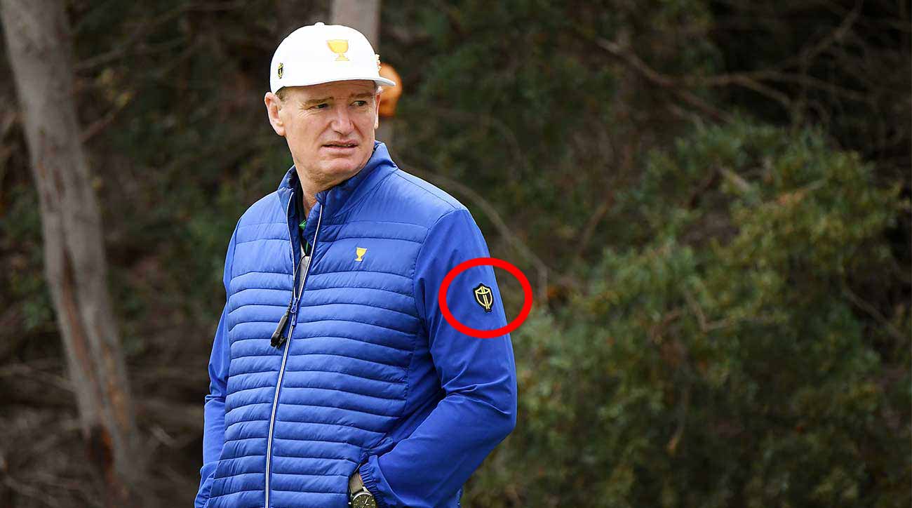
The logo is embroidered in gold in the outline of the Celtic knot, symbolizing friendship and loyalty. In the backdrop, a black coat of arms represents strength and unity. On top, the knot separates to form a pair of flags, an international symbol for golf.
Beyond the sleek design and color scheme, the logo seems to have given the International team a newfound kinship this week at Royal Melbourne. The Internationals seized their first Day 1 Presidents Cup lead since 2005 on Thursday, and have put the Americans on their heels in the early portion of the tournament.
ADVERTISEMENT
With a 4-1 lead, the International Team is back in black 🔊 pic.twitter.com/nszI5B9gOB
— GOLF.com (@GOLF_com) December 12, 2019
The logo was part of a larger effort to re-establish the identity of a decidedly one-sided tournament. An effort helped by the atmosphere at Royal Melbourne, which has already produced plenty of hotly contested matches and impressive celebrations.
There’s still plenty of tournament left for the U.S. team to rally, with eight matches on Saturday (four fourball matches and four foursomes matches) and an additional twelve singles matches on Sunday. But whether the Internationals are able to claim their first Presidents Cup victory since 1998 and second of all-time or not, there’s no question Ernie Els’s logo strategy had already produced its intended effect upon his team. Now all that’s left to see is if they can close out a victory.
To receive GOLF’s all-new newsletters, subscribe for free here.
ADVERTISEMENT
Which LIV Golf members are playing in the U.S. Open?
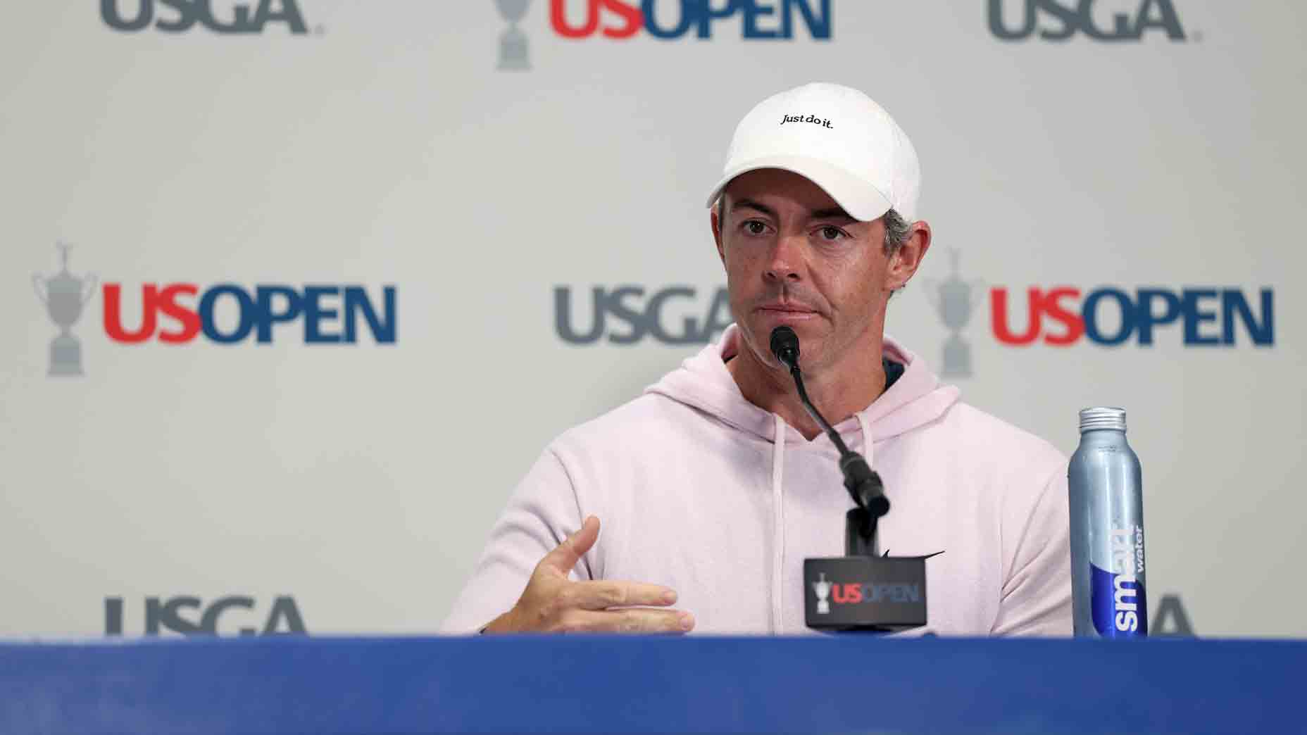 ‘LIV created this false economy’: Rory McIlroy opens up on Tour changes
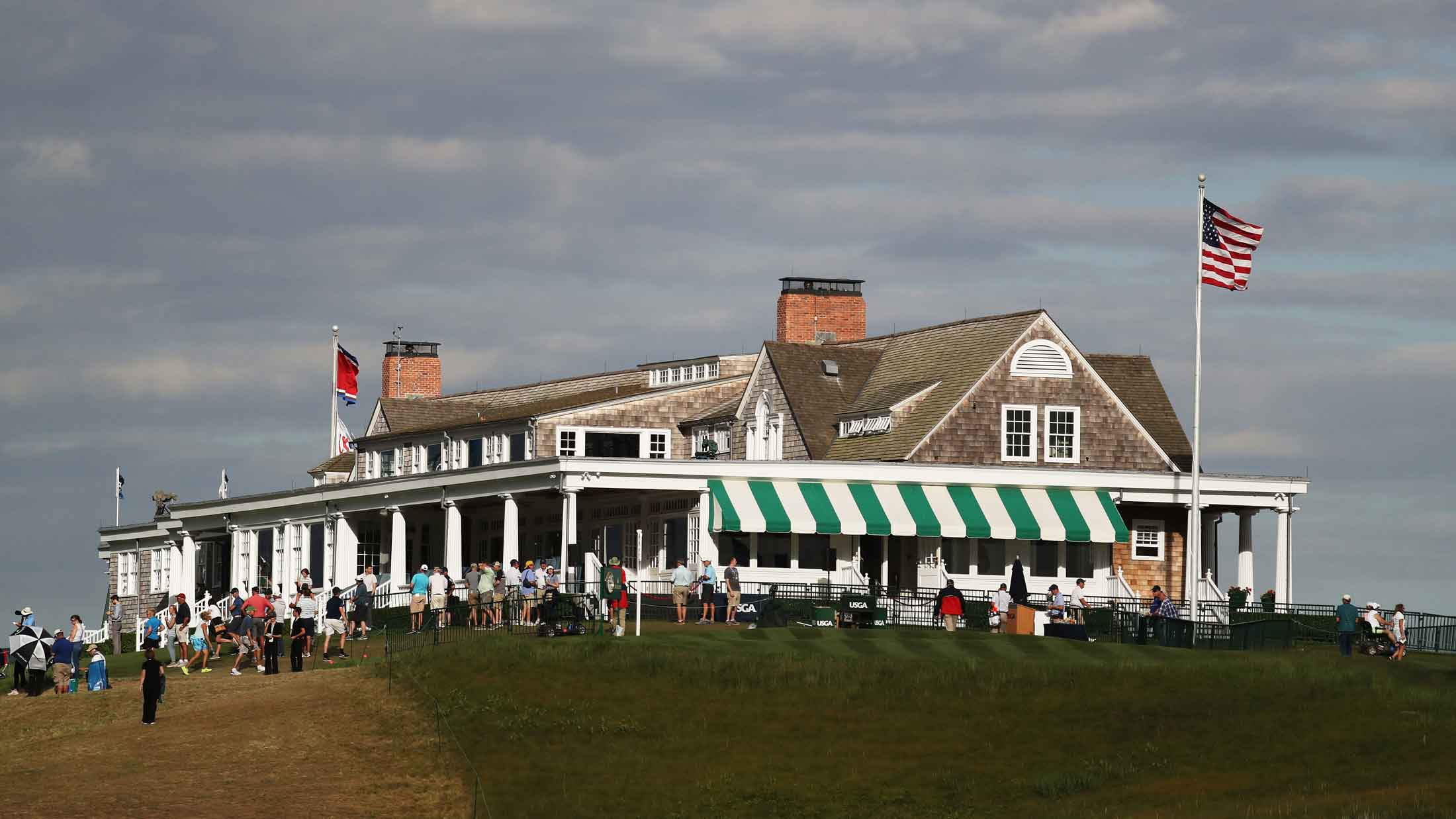 Shinnecock Hills and its six U.S. Opens are bridge to game’s history — and my own
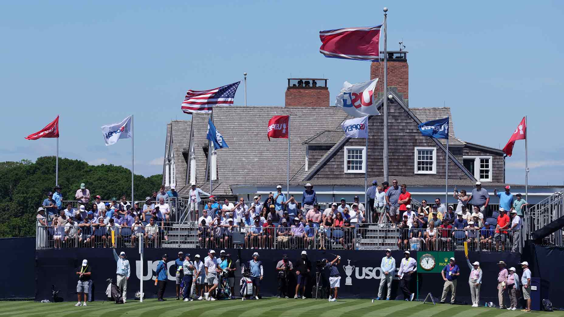 2026 U.S. Open viewer’s guide: Tee times for Rounds 1 and 2, TV schedule, streaming
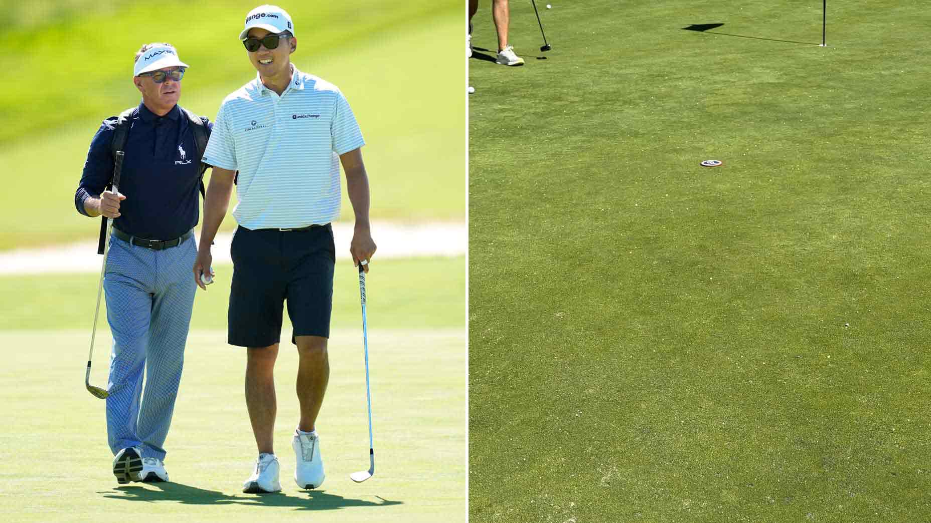 ‘Quite bumpy’: U.S. Open pro criticizes Shinnecock green conditions
Which LIV Golf members are playing in the U.S. Open?
‘LIV created this false economy’: Rory McIlroy opens up on Tour changes
Shinnecock Hills and its six U.S. Opens are bridge to game’s history — and my own
2026 U.S. Open viewer’s guide: Tee times for Rounds 1 and 2, TV schedule, streaming
‘Quite bumpy’: U.S. Open pro criticizes Shinnecock green conditions
‘Quite bumpy’: U.S. Open pro criticizes Shinnecock green conditions
Which LIV Golf members are playing in the U.S. Open?
‘LIV created this false economy’: Rory McIlroy opens up on Tour changes
Shinnecock Hills and its six U.S. Opens are bridge to game’s history — and my own
2026 U.S. Open viewer’s guide: Tee times for Rounds 1 and 2, TV schedule, streaming
‘Quite bumpy’: U.S. Open pro criticizes Shinnecock green conditions