
Ahhhh, Masters Sunday. A time to revel in Augusta National’s blooming azaleas, the CBS Sports broadcast’s tinkling piano intro music and the soothing voice of our longtime friend, Jim Nantz. It’s also a time when we hold our collective breath to see who will emerge as champion, thereby earning the right to don the most prestigious garment in all of golf: the green jacket.
Over the years, I’ve often wondered how much a player considers his Sunday ensemble. It’s serious business! Those photos in Butler Cabin and around the 18th green will live forever.
Avoiding a color clash with the green jacket should be a top priority for every player. And yet, even in the current age of manufacturer-dictated outfits (“scripting”), Sunday sartorial sins occur more frequently than you would think. So why is it that so many players get it wrong?
I asked GOLF Style Contributor Wendell Brown to identify some of his favorite and least favorite Sunday winners’ looks from the past 30 years, as well as his thoughts on which colors go best with the green jacket and which ones to avoid. Below, in no particular order, are his selections.
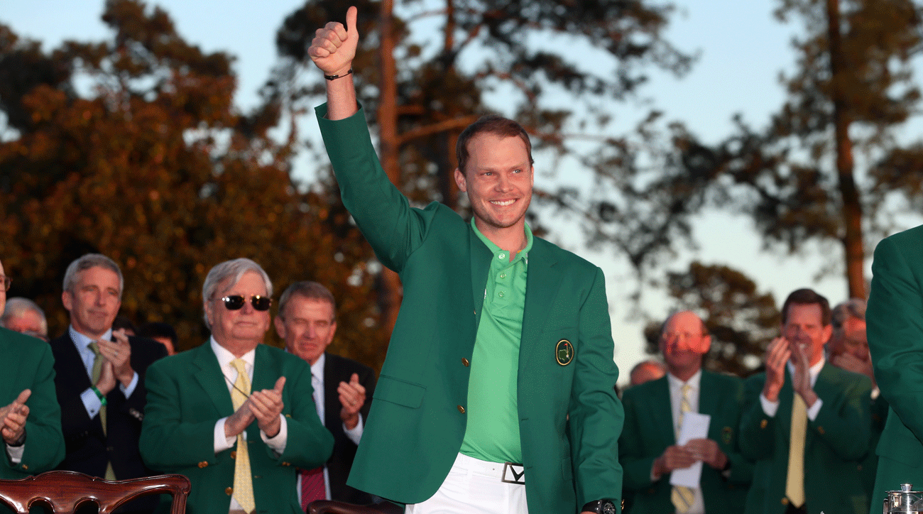
Green on green? Hmm. It may be counter-intuitive, but in this case, it worked.
“Danny Willett got it right for a number of reasons,” Brown says. “Because first of all, it’s really unexpected, right? Green on green. But the green polo, being also a much lighter green, doesn’t clash. It ended up oddly complementing his outfit, but it still looks unexpected. So it’s this combination of being kind of humble — maybe he didn’t think he would actually win? — and blending really well.”

Pink is generally considered a good on-camera color for men, but in this case — paired with the green jacket — it was no good.
“This is terrible,” Brown says. “I’m wondering if he did it on purpose, it’s so bad. If it had been a light pink, I think it could’ve been a lot nicer. This is like a superhero gone wrong. The athletic technical pink just clashes.”

You would think going neutral would be a safe bet on Masters Sunday, but Brown isn’t a fan of O’Meara’s understated beige.
“When people have a negative impression of golf style, this, to me, is exactly what they’re talking about,” Brown says. “It’s kind of dead, and looks like a business-casual cliché.”

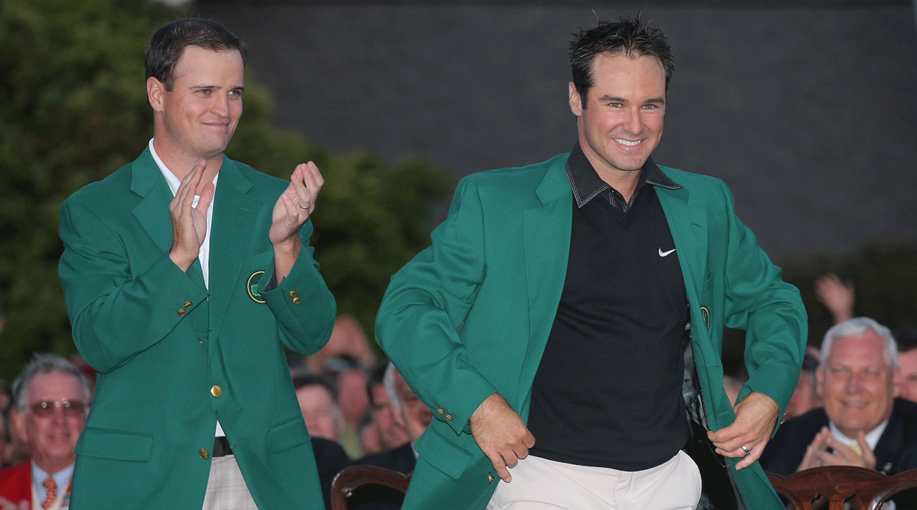
Think trying to play it safe with a black polo or sweater, a la Phil Mickelson’s Sunday staple, is a good play on Masters Sunday? Think again.
“Black is a don’t,” says Brown. “It looks a little dead. Just doesn’t look as ‘up.’ The weird thing about it is, without the green jacket, it looks really nice. It’s sharp. But the black and the green together just seems a bit too severe.”
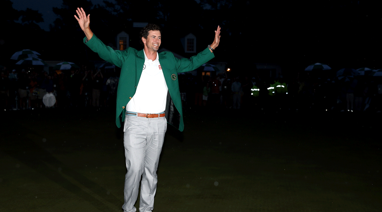
Is it any surprise that Adam Scott, GOLF’s most stylish man, nailed his Sunday look? Nope.
“I love his look here,” says Brown. “That’s excellent. That’s right on point. The green jacket actually looks like part of the outfit, it looks intentional. And the light gray pants go so nicely.”
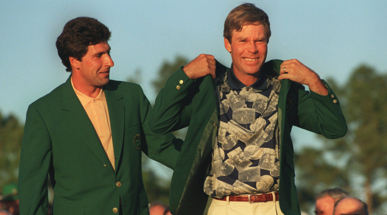
Busy prints? Verboten on Maters Sunday.
“Oh, that’s dreadful,” says Brown. “The colors just clash. The weird little photograph things on the polo, ugh. I can’t tell if the pants are yellow or just a really odd buttery khaki. But they look awful together. And then with the green on top of it, it’s just like, completely gone wrong. It’s too busy.”

You may think that graphic prints would also be an obvious no-no, but Brown says they can actually work in the right circumstances.
“This particular print looks nice,” Brown says. “When it comes to graphics, it’s about having complementary colors. The polo’s white background helps because that doesn’t make it seem too busy, it makes it seem much more fresh. And then the fact that the print is navy and a lighter blue, those are just really great complementary colors to a green. You can’t go wrong when you pair blues with green.”


Yellow is definitely a do on Masters Sunday.
“Yellow and green go beautifully together,” says Brown. “This looks really nice, and even ties in the pop of yellow on the Masters emblem on the jacket.”
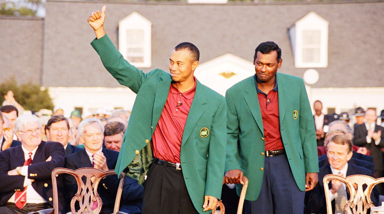
Obviously, Tiger is known for Sunday red. But some shades complement the jacket better than others.
“Sunday red is Tiger’s thing, so it doesn’t bother me,” says Brown. “It actually almost looks good, because it’s his signature. This shade is like a tomato red. I think it’s nice. And it highlights the little Masters flag in the patch, too.”

We already know that Sunday black in no good. But how about Schwartzel’s black and gray horizontal stripes?
“I don’t like this,” says Brown. “The dark black stripes, from black to earth tone, do not go well with the green at all.”
Now that we know which colors historically do and don’t work with the green jacket, what are some rules players should heed this year?
“One trick that I’ve always heard about with that shade of green is to treat it like it’s navy blue,” says Brown. “There are quite a few things that if you were going to wear a navy blazer, you can wear with a dark green.”
WENDELL’S RULES
1. When in doubt, go with solid colors: yellow, muted red, white and light blue are surefire hits.
2. Subtle graphics are better than stripes.
3. Wear really light-colored pants, like white or pale gray, or a really dark color, like navy blue.
4. Whatever you do, don’t wear black!
To receive GOLF’s all-new newsletters, subscribe for free here.