
To golf fans watching from home, context is everything in team match-play events. Yes, the score of the match you’re watching in any given moment matters, but not knowing the status of all the other matches in any given moment diminishes the viewing experience.
The isn’t a new observation, but I was reminded of it yet again as I sat on my couch Sunday afternoon watching the final session of the Presidents Cup. The U.S. held a commanding four-point lead to begin the day, but with 12 singles matches being contested concurrently and the International team battling hard, the situation still felt fluid. And yet without a steady flow of visually digestible scoring updates, it was difficult for viewers to grasp exactly how fluid.
As we’ve seen in other match-play telecasts, such as the Ryder Cup and Solheim Cup, NBC/Golf Channel leaned on scoring graphics to help tell some of the story — for example, individual match updates as the telecast jumped from one match to the next, or another graphic that showed the overall status of the matches along with how many matches each side was winning or losing.

But one critical element was missing from that data: the status of each match.
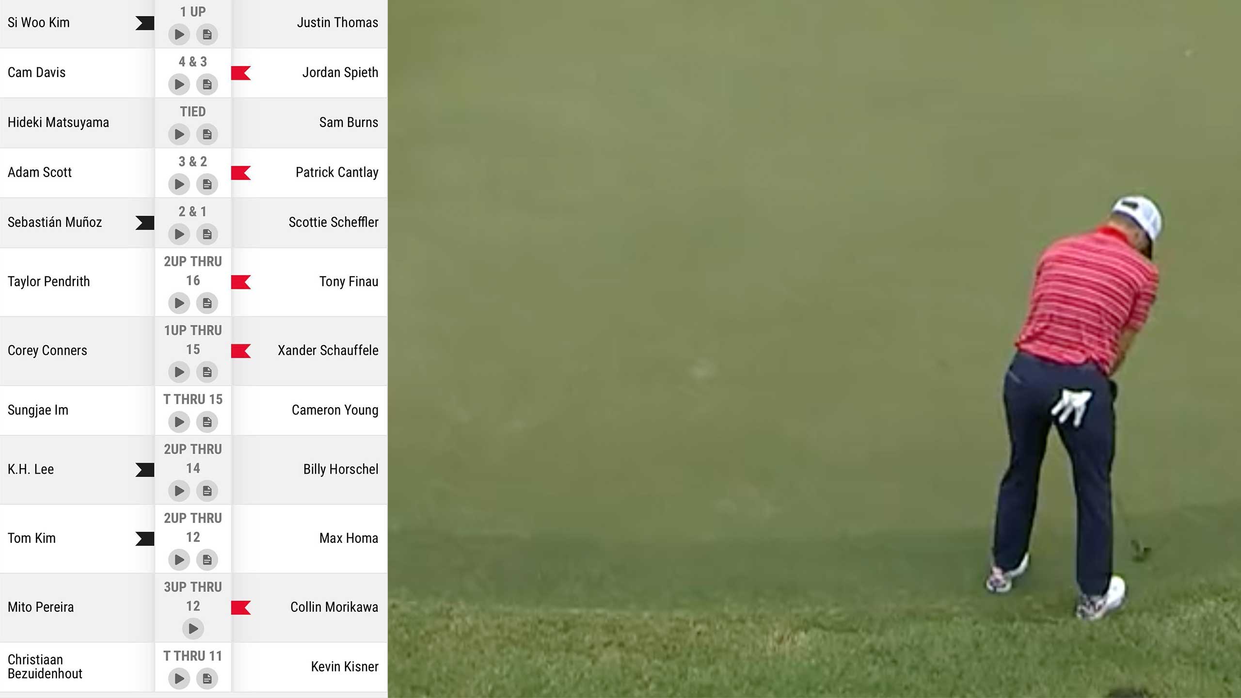
Take Sunday singles. Alerting viewers that, say, the “U.S. is leading in 3 matches, down in 3 matches and tied in 2” is a helpful update but also wholly incomplete. Leading by how many? Losing by how many? And in which matches? That’s information — and context — that fans are eager to know, ideally without having to endlessly refresh their phones.
Here, traditionalists will scoff. Surely, you’re not suggesting 12 match scores on the screen at once? Surely, I am! Yes, it would add more clutter but it’s doable, and, in this observer’s mind, the good would far outweigh the bad. LIV Golf’s perma-leaderboard, which runs down the left side of the frame, is actually a good model, minus the garish team logos. Why couldn’t team match-play telecasts do something similar, employing a slender graphic throughout the telecast that immediately gives viewers a snapshot of where each match stands?

Here’s a (very) raw mock-up pairing a screen-grab from the Presidents Cup telecast Sunday with the PGA Tour’s mobile leaderboard. A graphics whiz could dream up a much cleaner execution, but you get the idea:

This graphic could and should easily include more than just scoring. Another nifty add would be the probability that each team would win a match in any given moment, based on historical data from past events. Three-up through 13 holes? Here are the odds that the leading fourball team will prevail. The graphic could also include the odds that one side or the other, based on their lead in any given moment, would go on to win the overall competition. Bettors, in particular, would dig the intel, but so would casual fans.
With so few match-play events on television, it’s not hard to understand why the networks might not pour their creative energy into the presentations of these telecasts. But providing viewers more context should always be a top priority. It makes golf-viewing more fun.


